Monday, 6 October 2014

Magazine Advert Analysis

Any magazine advert should in theory be as eye-catching as possible and thus help to persuade the reader to buy the album once it is released, if not already. The conventions of a typical album advert would include the name of the artist and/or their logo, the album title, and singles which have been released pre album release and the album release date, and sometimes where to buy the album. A magazine advert for a CD album would usually consist of an exact replica of the album cover artwork as this would help the consumers to recognise and be familiar with the album cover and the artist for when they go to purchase the CD in stores or online. The place which the advert is found in can also play an important role in the identification of the album genre and whom the target audience for the artist may be. For example; an advert for am album under a boy band is most likely to be found in teenage magazines and not a magazine such as Kerrang!


5 SECONDS OF SUMMER
The first album advert which I chose to analyse was for 5 Seconds Of Summer's debut album, released June 2014. This particular album advert I didn't find in a magazine, but in the One Direction 2014 tour programme, therefore you can note the difference in shape of the advert, as opposed to the traditional a4 magazine layout size. The album advert features all the basic conventions which were previously stated, apart from potential places where the album could be purchased or pre-ordered. The advert features the artist name and logo at the top of the page, it includes the release date, any singles which had already been released and also the exact image replica from the CD album cover. Therefore, this is an effective album advert because it engages the reader to register who the artist is and a rough idea of what the album cover would look like in order to spot it in stores or online.
The official website link is also seen in the bottom right hand corner of the album advert. This can help readers to identify the brand of the band and is also a form of synergy which can help readers to go online and find out more about the band if they wish.


OLLY MURS
The second album advert which I chose to analyse was for Olly Murs debut album in 2010. The album advert once again features all the basic conventions mentioned for an album advert; the album release date, singles already released, the album name and the artist.
The interesting thing about this advert, similarly to the 5 Seconds Of Summer one is that the album name is never explicitly written, leaving the reader to question whether the album is a self-titled album or if the name is missing from the advert. In both cases, they are self-titled albums, however this can be slightly unclear to the reader and may be a negative side of both these adverts.

Once again, the album advert is a direct replica of the image used on the front cover of the CD. The advert uses the same colour scheme as the CD, which may perhaps help the reader to identify the artist and what the album will look like in stores so it can be easier for them to find if they wish to purchase it once it has been released, or even as a pre-order online.

The official website is also listed underneath the album release date, this allows readers to go online and find out more about the specific artist if they wish to do so.
It may also be important to note that the release date is displayed in a different colour to the rest of the text which makes it stand out more and puts more emphasis on the importance of the release date than any other information listed on the advert.


YOU ME AT SIX
The third album advert which I chose to analyse was for You
Me At Six's album 'Hold Me Down' which was released in 2010. Once again this advert follows the same conventions as the other two adverts previously mentioned.

The interesting thing with this advert is that it doesn't spell out the album name, although obvious, it leaves it up to the reader to figure out the album name, which is shown underneath the artist name. The album release date is shown in a different colour to the rest of the font which places emphasis on the importance of the release date and it stands out to the reader straight away which immediately informs the reader when the album is released.

The album advert is once again a direct replica of the CD album cover, which also once again helps the reader to be able to identify the album in stores or online or on iTunes if they wish to purchase it once available, or pre-order it as it is not yet available.

An interesting aspect of this album advert is that underneath the release date there is a website which you can purchase the album at - Play.com. This suggests that perhaps Play.com are sponsoring the album advert because that can't be the only place which the album is available at, yet it is the only place visible on the album advert, which suggests to me that Play.com have sponsored You Me At Six' album advert.

LANA DEL REY
The fourth and final album advert which I chose to analyse was for Del Rey's 'Born To Die' album, released in 2012. This album advert was taken from Q magazine which suggests to me that the genre of this album must be indie as Q magazine features mostly indie and alternative artists, therefore the chances of this being a pop album are slimmer due to the magazine this advert was found in. The album advert is once again a direct replica of the album cover.

This album advert, very similarly to the You Me At Six advert, features the amazon logo in the bottom left hand corner, meaning that the album can be purchased from amazon. However, once again amazon is most obviously not going to be the only place which this album can be purchased at, and once again perhaps this advert is sponsored by amazon so therefore their logo is featured on the advert to encourage readers to purchase the album from amazon as opposed to other websites or shops.


Below are the full in depth analyses of each of these album adverts identified above.


After analysing different album adverts of different artists and different genres, I have learnt that most artists play it safe and use an exact replica of their album cover for album advertisements. I feel that this is probably an effective marketing strategy because the customers will know straight away what to look for in shops or online if they wish to purchase the album and they will also be familiarised with the artist, if not already. All four of the album adverts which I have analysed are identical replicas of the album cover, it is rather rare to find an artist using different images on an album advert in contrast to the album cover.


Friday, 3 October 2014

Digipak VS Jewel Case CDs

As previously identified a Digipak is a type of packaging for CDs or DVDs, typically made from cardboard with an internal plastic holder for one or more discs. A Jewel Case CD is a three-piece plastic case that usually contains a compact disc along with an insert booklet and a back tray card.

Usually, an album will be released either as Jewel Case format or as Digipak format, rarely as both. However, sometimes the standard version of an album will be released as Jewel Case format and the deluxe version will be released as Digipak format. For example; (as previously shown) Justin Bieber's 'Believe' was released as a Jewel Case CD for the standard edition of the album, however the deluxe edition was released as a Digipak. In these instances, not much usually differs beteween the Jewel Case version and the Digipak version, besides perhaps the colour scheme to help distinguish the difference between the standard and deluxe edition.

However, sometimes the Jewel Case version can differ massively from the Digipak version of an album. For example; The Jonas Brothers self-titled album, released in 2007, came in standard Jewel Case form, and also came in a 'Bonus Jonas Edition' Digipak format. The standard Jewel Case version differs from the Digipak version in the sense that it comes with an insert booklet when the Digipak does not. The Jewel Case version features lots of photos inside the booklet for the fans to enjoy looking at. Whilst the Digipak doesn't have any insert booklet, and only two photos of the group are seen inside. The Digipak however includes two disks, one featuring the songs, and one featuring a bonus concert and other content, the Jewel Case only includes one disk with only songs.

The album cover for the standard Jewel Case CD is found only once on the Digipak version, which is on the inside of the Digipak, it is also interesting to note that they both have different album covers, one being far more basic than the other.

The art on the CD disk also differs between the two version of the album. The Jewel Case version has a much more simple disk, which is white and features the band logo at the top of the disk, whereas the Digipak version has two disks and are cleverly designed with the initials of 'JB' featured on each disk, which is dark coloured unlike the white disk from the Jewel Case.


Overall, not much does usually differ between a Jewel Case CD and a Digipak CD, except for the obvious choice of material for the casing. As time has progressed, Digipak's have undoubtedly become far more popular and widely used, however the traditional Jewel Case CD will probably always be the more popular option, and in my opinion I prefer the Jewel Case to the Digipak.


Thursday, 2 October 2014

Digipak Analysis

Once defining what a Digipak actually is, I then went on to analyse some of my own Digipak's to help with the identification and recognition of the different conventions of genres and type of artists and recognising how the artist may interact with their fanbase through the design of their Digipak etc.


Justin Bieber: Believe (2012)
The first Digipak which I analysed was Justin Bieber; 'Believe' which was released in 2012. Justin Bieber is a pop artist with a young female target audience. Believe is the third studio album from Bieber and was released 15 June 2012 under Island Records. Believe was the sixth global best-selling album of 2012 with sales of three million copies.

Whilst analysing this Digipak I noticed that his face played a very dominant part of the front cover, perhaps due to attracting and pleasing his young fans with his good looks. The full analysis of this Digipak is featured in the overall analysis of all three of these Digipaks at the bottom, which can be displayed on Prezi.

This Digipak opens up and inside the middle pannel of the Digipak an insert booklet can be found which features a whole ton of photos from the album photoshoot. This is an interesting use of the booklet because most insert booklets will usually feature lyrics or content, however this booklet only features photos. This further stresses the importance of the fanbase and perhaps also the way in which Justin Bieber and his record label hope to sell his album and through audience research know that his fans would prefer to look at exclusive photos of him than read the lyrics of the songs on the album etc.
The Digipak also comes with a six-pannel fold out poster for his fans to enjoy and maybe put it on their bedroom wall. This shows that there is a more personal connection between the artist and the fans and it also emphasises that this is a pop album aimed for young female girls.


All Time Low: Don't Panic (2012)
Don't Panic is the fifth studio album by American pop punk band All Time Low, released on 8 October 2012 by Hopeless Records.


The second Digipak I devided to analyse was All Time Low; 'Don't Panic'. All Time Low are a pop-punk artist with a rather varied target audience, but majority being female and probably age ranging between 15 - 25. This Digipak differs quite a bit from the Justin Bieber Digipak that I had previously analysed. The reason I think this is might be due to the different genre of music and the different type of target audience, therefore the band will try and produce a product fit for their target audience and not Justin Bieber's target audience, therefore it is not much of a surprise that they are different.

An interesting aspect of this Digipak is that not once is there a photo of the band, the only replica of their images is a cartoon drawing, which fits in with the flowing theme of cartoon and animation. This also strengthens the idea that this artist does not rely on their image for their sales or to please their fans. Unlike Justin Bieber, who can use his good looks to his advantage and therefore fans would be dissapointed if he was not pictured on his album. Whereas the older fanbase of All Time Low will probably be more interested in the songs on the album than looking at their pictures in their album.


One Direction: Midnight Memories (2013)

Midnight Memories is the third studio album by boyband; One Direction and was released on 25 November 2013 by Syco Music and Sony Music. The album debuted at number one on the US Billboard 200, making One Direction the first group in history to debut at number one in the US with their first three albums. Despite being released five weeks before the end of 2013, Midnight Memories still managed to become the best-selling album of 2013 with sales of four million copies.

This is the third Digipak which I decided to analyse. One Direction are a pop boyband which also have a young female target audience, however they also attract many older females. This Digipak is however slightly different to the other two Digipak's that I have analysed. This is because this Digipak is almost like a mini book and is made with a much more solid material, whereas the Bieber and All Time Low Digipak's were made with a strong cardboard. The 1D Digipak opens up with the CD disk on the first page, and then the booklet carries on to view different pictures of the band from the album photoshoot, behind the scenes photos from events over the past year and also a double spread fan collage page, which shows that the band have a close connection with their fanbase.


Through looking at different artists and their Digipaks I have learnt that although I have defined what a Digipak is, I believe that their is no definition to Digipaks. Digipaks can come in any shape, size or material and can be essentially whatever platform the artist is willing to release their album onto. It does seem that the traditional Jewel Case type CD is still widely used, yet the Digipak has become far more popular in recent years. Many artists nowadays will release two different versions of their album - a standard version and a deluxe version - and often artists will release the standard version in Jewel Case format whilst the deluxe edition will be released in Digipak format.

Wednesday, 1 October 2014

What is a Digipak?

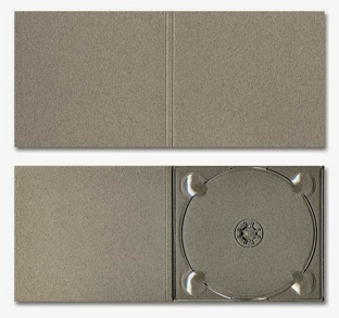
A Digipak is a type of packaging for CDs or DVDs, typically made from cardboard with an internal plastic holder for one or more discs. Digipacks can either flip open like a book, or it can have three parts, so that one part of the packaging opens to the right and one to the left, with the CD in the centre section. Usually the part of the Digipack that holds the CD will be made of plastic just like a traditional jewel case CD  and the plastic part will be attached to the paper background.


Digipak's were first created by MeadWestvaco, and their product, called 'Digi-Pak', is trademarked. However, as the format gradually became more popular and began to be used more commonly by manufacturers, the generic "Digipak" came to be used to describe all soft CD packaging. Seeing as Digipaks were among the first of alternatives to jewel case cds to be used by major record companies and because there is no other common name for Digipak-style packaging, the term digipak or 'Digi-pak' is often used as a generic term.

It can be found that Digipak-style packaging is often used for CD singles or for special editions of CD albums. Such packaging is less resistant to abrasion than jewel cases, therefore it tends to show signs of wear relatively quickly and easily. However, it is believed that some Digipaks are printed with a protective UV coating which should ensure greater strength. 


Digipak Measurements

When it comes to the actual production of my Digipak, it is important that I have the correct measurements in order to allow for the most professional outcome. Therefore, instead of simply looking up on the internet the measurements for a Digipak, I thought it would be slightly more creative to film myself physically measuring a Digipak of mine and folding it into panels to grasp an idea of what the final outcome may look like.


Theories and conventions that will help with the production of a successful music video

Andrew Goodwin is a key theorist who will hopefully help with the creation of a successful music video by studying the conventions that he states in his music video theory.

The conventions he states are as follows:
- A relationship between the lyrics and the visuals
-
A relationship between the music and the visuals
- Genre-related style and iconography present.
- Multiple close-ups of the main artist or vocalist.
- Voyeurism often plays a major part, especially in relation to females
- Intertextual references to other media texts may be present.


I have done an analysis of the music video to 'Live While We're Young' by One Direction whilst following Andrew Goodwin's music video theory and using his conventions to look out for each of his statements. I chose this music video to analyse because I felt that there was going to be an inevitable relationship between the lyrics and the visuals - which is Andrew Goodwin's first statement of his theory.


Introduction


Looking at the massive variety of different genres and sub-genres within the music industry today, the chances are that the wide variety of genres will also feature a huge directory of music videos and albums.

Music videos today can range from anything such as; your basic love - story narrative with Taylor Swift music videos such as 'You Belong With Me' to highly original and wacky videos such as Coldplay's 'The Scientist' which sees the whole video in rewind.

As technology has advanced over the years, cds have become less popular with the likes of iTunes and MP3 downloads as high competitors, therefore the importance of cd's may be of less significance today than perhaps 10 years ago.

However, cds are still purchased, for example; I would still prefer to have a physical copy of my favourite artist's new album or single than just an iTunes copy, therefore I still purchase cd's. Meaning that I have quite a big collection on my bedroom shelf and it is interesting to observe the different cd disk and booklet designs dependant on the genre of music. For example; a pop band or artist will usually have a brightly coloured album featuring maybe conventions of pop such as silly poses or sometimes serious poses which help to reinforce the important of the artists' fan base, and the artist will more often than not, be featured on the front cover of the album. Whereas indie or punk-rock artists will tend to stick to a more bland album cover and can often be metaphorically presented with an image on the front, which is usually not of the artist themselves but of something that will connote with the album title.

The a2 coursework which I will be creating this year consists of the main body of creating a music video and then two of the three of the following: Creating a digipak for your chosen artist, creating an album advert for your chosen artist or creating a website for your chosen artist. I have chosen the first two; a digipak and an album advert.

I will be looking deeper into the world of music videos, digipaks and album adverts throughout the coursework, thus helping me to grasp a greater understanding and knowledge of the importance of music videos and digipaks in relation to helping sell the artist