Monday, 22 December 2014

The Shoot (Second attempt!)

I have just gotten home from our shoot, which was a massive success!

Seeing as the footage which the group had got from the previous shoot wasn't much use to us, we needed to re-shoot the footage and extra which we hadn't got from the previous shoot. We therefore changed location and timing. We decided to film in a forest opposite Zach's grandparents in Cockfosters, which was easier for most people to get to, whereas the previous shoot had been in Essex which was not ideal for anyone apart from Zach to get to! We told the cast to meet us by Cockfosters station at 11:30am, but we met earlier for brunch and so that we could discuss what needed to be shot etc.

Zach has a close group of friends (about 10 of them) who all helped us out by coming to the shoot, and then earlier on in the week we realised that we still needed a lead role for the lip synching, and I had the perfect person in mind - my friend Danny. Therefore I messaged him to see if 1) he would be willing to take on that role and 2) if he was free for the shoot (Monday 22nd December), and I was successful!

Zach guided us to the shoot location, and once everyone had arrived we were ready for action! We started filming at around 12:15pm which was about 3 hours earlier than the first shoot - already a major advantage and the lighting in the footage came out 100x better! We decided to scrap any footage which was recorded from the previous shoot and just start from scratch as the lighting was so much better and the footage looked much more professional on the camera, therefore it was a good idea to just start from the beginning, which we did.

Although it was rather chilly out, everyone braced the coldness and collectively we felt that overall the shoot was very successful! Zach's grandma even made us cheese sandwiches as a small snack during our 10 minute break which was lovely of her as we were all hungry!!

Here are some behind the scenes photos:


Wednesday, 17 December 2014

Album advert (iTunes)

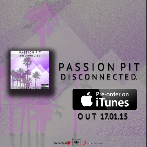
It is important to realise that magazines are not the only resource suitable to place album adverts, but also web adverts to advertise albums and online links to pre - order/buy the album, in particular with iTunes. I therefore also decided to play around with the possibility of iTunes adverts as well as the magazine advertisement. Here were two of the outcomes:


I also wanted to see out of interest what my album artwork and advertisement would look like on the iTunes homepage and pre -order page:


Moving onto the album advert

Once the Digipak has been completed (or very nearly almost) it becomes time to look at designing the album advertisement. It is important to create an advert which stands out to the reader in a magazine, so that they can be informed about the artist, their album, the release date and where the album can be purchased when it is released (if not already).

It is important to also follow the same or a similar theme to the album cover so that it becomes easily identifiable to the customer and also within the band's identity.

I started playing around with Photoshop yet again, keeping the same template of the purple background with the faded palm trees, and this was my first outcome:


I didn't however, feel completely satisfied with this outcome. Although following the exact same template as the album cover, this time around I didn't feel that it worked for the album advert and I didn't think that it looked very professional, nor did I feel that it was completely eye catching if flicking through a magazine. All the key details needed for an effective album advertisement are shown clearly on this advert, however I feel that it looks messy so I am therefore going to have another go.

On my second attempt, I thought, what was it that I didn't particularly like about the first album advert I created? And from these dislikes I would then go on to adjust these changes to hopefully create a better product which I much preferred to the first. I realised that although it works really well on the album cover, I wasn't too fond of the colour scheme used for the album advert. Therefore I worked with the same template but tried to darken the colours a bit to add a slightly more professional touch. I therefore chose a soft grey to make the background less bright and purple. I also realised one aspect of the first design which I didn't like was that it was very busy and there was a lot of text everywhere, I then thought that maybe keeping it simpler would be more effective, so I cut down on the text used, but still keeping all the key and necessary information on the advert design. 


I am far more satisfied with this outcome than the first, so I am therefore going to be using this as my finished album advertisement.


Conventions:

The record label


Included in the album


Where to purchase the album 


Record label logo and band logo 


Tuesday, 16 December 2014

Feedback on footage


We showed our media teacher the footage which we had, and we gathered some key feedback:

Problem: "The narrative is fairly ambiguous and there isn't enough focus on the characters emotions and it's unclear on who is who". 
Our solution: When we re-film we will include a prologue which will give an in depth insight about the main girl. Moreover, we will dress each person in distinguishable clothes so that the audience knows what character is on screen. Maybe more close-ups would help draw out a narrative and emotions too?

Problem: "It is a bit like a short film, rather than a music video".
Our solution: We will include some lip synching and introduce a lead singer (the guy who offers the girl the drink) which should reiterate the fact that we are producing a music video, not a short film.

Problem: "While the filter looks fairly creative and does fit with the genre of music, the juxtaposition between shots in terms of light and darkness is too much".
Our solution: We will 100% film it in the daytime now. The night was too much a challenge and my own camera is incapable of picking up such dark conditions without the purchasing of an expensive lens with a low aperture. 

Problem: "The party atmosphere isn't really there".
Solution: We will include more lively behaviour, more shots of drink and the daytime filming should induce the party theme.

This has shown us that we will need to reshoot our footage, which means scheduling another filming date: Monday 22nd December, which funnily enough turns out to be the exact date shown on our Dipity timeline for the shoot date! We aim to start filming much much earlier than the first shoot, hopefully be shooting by midday, whilst it is still light out, and aim to finish just as it is getting dark. We have also changed the location to a forest right next to Trent Park which is much more practical and ideal for the majority of the group and cast to get to, as opposed to going back to Essex where the first footage was recorded.

Monday, 15 December 2014

The Shoot: Day 1: Behind The Scenes

From what I have been told about the shoot, Abi took on the role of getting any behind the scenes footage of the shoot. However, due to the poor lighting they were only able to take any effective behind the scenes photos at the very beginning of the filming and not really very much after that.

Here are some of the images which Abi took:


The Shoot: Day 1

So, we had our shoot scheduled for Sunday 14th December, of which still went ahead. However, unfortunately I came home from school on Wednesday feeling ill which I had hoped would pass, but on Sunday I was still in bed ill, so unfortunately I was unable to make it along for the shoot, but of course, the other three team members were all still able to make it. I am so sorry to the team that I let down, but now I am better and ready to get on with the editing of the footage which they got from the shoot on Sunday.

I therefore got the low-down on what happened at the shoot from my fellow group members. The group met at around 2pm in Essex, met the cast (of which consisted of around 10 people) and then headed to the forest for shooting. They chose to initially start with a photoshoot to produce stills of the music video shoot, which came out pretty good as the lighting was great then, just before it got dark. However, looking back now this was probably a small rookie error because the actual footage which was recorded came out too dark and grainy because it got too dark and too much time was spent on doing the photoshoot earlier on. Therefore, this is a lesson learnt for the second shooting where we will make sure we start filming much earlier so that the footage comes out brighter and better quality.

The filming didn't start until around 3:15pm which straight away seemed a mistake and it became very clear that the group were working in a race against time before it got dark, and hadn't allowed enough time before the darkness overcame. The footage completed was done by successfully following the storyboard which had been previously created and all the necessary shots were filmed in the correct order etc; and when it came to editing the beginning of the video this was extremely helpful.

The weather was fortunately dry and sunny which helped to enhance the lighting of the shots, and as long as it wasn't raining then all is good! Although I was wrapped up nice and warm up bed, the rest of my group were out in the freezing cold filming all afternoon for our video, however luckily everyone came dressed appropriately as they had been told that it would be cold.

Here is the footage we got, with a bit of editing:


The problems:

Problem 1: The cast

As a bunch of teenagers normally are, the actors couldn't keep still. They wasted endless hours playing with the sparklers and chatting which could have been time we spent filming. Now we have to order more sparklers too.

Problem 2: The time
Many of the cast live quite far away and so by the time we started filming it was time for them to go home which meant not much 

Problem 3: The lighting
As it is winter time, we forgot how quickly it gets dark. By around 4.30pm, it was so dark that you could barely see a metre in front of you. This meant that there were tonnes of miscommunications between the actors and director but worst of all it caused all sorts of problems with some of the camera shots. Our light source was either too bright or not bright enough an overall the quality of the footage just wasn't good. Below are some examples:

There is an incredible amount of visible 'noise' in this screenshot from the footage which looks highly unprofessional and collectively we weren't very happy about, and not even Final Cut could fix this! There is also the error of copyright with the beer logo visible to the viewer, we therefore can't have this because of Trade Mark laws. 


Overexposure was the problem when looking at this shot. The problem wasn't the camera, but the fact that our LED light was placed too close to the actor. It was hard to find a balance as too far and its noisy, too close and its overexposed and unnatural. 


Again, noise was a problem in this shot. Plus the light was in a bad position and the top half is underexposed, bottom overexposed. It's just unprofessional. And the fact that the light source keeps jumping around is just comical too as it's another continuity error to add to our long list.


The overall outcome of the footage which was recorded is one of mixed feelings. At first glance, Zach was not at all satisfied with the footage and believed that it looked far too dark and grainy. However, of course we didn't have all the footage anyway and would need to shoot on another day or two anyway so the initial idea was to reshoot the footage earlier on in the day when the lighting is better. However, once Zach put the footage onto Final Cut and played around with some of the effects and watched some of Passion Pit's music videos for editing inspiration, he added a sort of vintage effect to the footage and it somehow enhanced the footage and took any notice off of the graininess, this really reflected the music video 'The Reeling' by Passion Pit. He then showed our teacher who said that it looked much better with the effect on it. However, one item of feedback which stood out to me from the teacher was that there is a lack of initial narrative and that the audience may be slightly confused by the context, therefore we need to adapt on a stronger narrative for the future shoot(s).


Storyboard

Creating a storyboard for any creative production can be useful, but for a video production or animation it is absolutely vital. By planning each shot beforehand, directors and crew can understand what they are aiming to achieve and have something to build on.

The concept of storyboarding is similar to working on a comic strip as such, and quite simply requires each and every shot to be drawn in a box, and sometimes, more often than not, with a strip of writing underneath it explaining what is happening in this specific shot. Storyboarding can also allow directors to play around with angles, perspective and balance to create the shot that they desire and therefore can require a very careful eye and a lot of time and precision. For example, storyboards usually take into consideration whether the shot is interior or exterior, whether it is an upwards angle or downwards angle and also whether the actors should be positioned in a close-up, medium or long-distance shot.

All storyboards and different and unique, and they should be a product of what the director needs to help visualise his production. Some prefer to have quick and simple sketches as their storyboards, whilst others like to spend a lot more time, money and effort on making detailed storyboards.


The storyboarding process is an important one for the following reasons:
  • To deliver its message effectively, a video or film production needs to be well planned. Even a family event video will benefit from planning.
  • Storyboarding helps you to think about how you want your finished film to look, how the story should unfold, and what shots will best convey your story to your audience.
  • With your storyboard in place, you’ll waste less time setting up shots because you’ll know exactly what scenes you need to shoot, and where to shoot them from.
  • Storyboarding is especially useful for planning complex sequences of events, saving you from shooting footage you can’t use or missing footage that is essential to the plot.

Zach took on the role of illustrating and creating the storyboard, which I think by the end of it, he was beginning to regret! But of course, Zach still managed to get the task completed in due time. And here is the finished storyboard:


Animatic 

Thursday, 11 December 2014

Rough template of Digipak


Once I had got my 6 panel Digipak template off the internet I was able to place my panels onto it in order to get a rough idea of what the final product could look like.

One mistake which I learnt from placing my panels onto the template was that I noticed the sizing of each panel actually didn't fit correctly onto the template, which means that I will need to alter the sizing of each panel to the correct measurement dimensions. Therefore when I can access Phototshop again when i'm at school I will see what I can do to change this so that it is the right measurements.

Note that there is also a blank panel, this is because I am yet to decide what I would like to put on that panel and therefore I am going to leave it blank until I have decided.

Tuesday, 9 December 2014

Casting

Seeing as we only need to cast three characters, our music video does not require too much effort with the casting aspect of the video. These characters include:

  1. One Girl (the main character)
  2. A boy (lead singer)
  3. Another boy (love interest) 

We do still need background characters, which will give the 'forest party' an atmosphere, these people have no specific role or input towards the story or any of the characters, they are just there to add a party atmosphere.

Luckily the roles needed for our video didn't really require really specific personality or looks, so we could be quite open with the casting. However, one aspect which we needed to take into consideration was the fact that we would be filming during the Christmas holidays and we needed to find people which would be 1) reliable and 2) are available during the holidays and aren't away when we may need them for our shoot. 

Therefore, Zach had a close group of friends which he believed would be able to help out and therefore he created a Facebook group titled 'Media Filming' and then added as many people as he could to it, most of them being teenagers our age (which we intended to cast anyway) and then he posted all the details for the shoot on the page.


We also needed to find a lead singer who would be happy to lip synch for our video - of which I had the perfect person in mind - my friend Danny.

Here are some shots of the main characters cast:

Danny - Lead singer


Emmet - Main male role


Roxanne - Main female role


Preparing for the shoot

As a group we have collectively decided that we will be filming our music video this coming Sunday, the 14th December. And given the fact that we are in the solid months of winter, we must make sure we are prepared for our shoot under any circumstances or obstacles which we could be posed with, i.e: snow, rain and darkness.

Weather:

The weather throughout November and December has actually been fairly warm in comparison to previous years. However, the weather this past week has dropped very low and has been exceptionally cold and after researching into the weather forecast for the coming week, and in particular our shoot day, according to BBC weather it may be highs of 9°C and lows of 5°C and cloudy, which would be absolutely fine for our shoot, as long as no snow it's all good!


(Update: 19th Dec) Seeing as we didn't get all the footage we needed, we are shooting again on Monday 22nd Dec, however the location has changed slightly and obviously the weather conditions may be difficult which is important to take into consideration. 

I looked up the weather forecast for Monday on BBC weather, and it says that it should be dry and maximum of 13 degrees and lows of 10, which, although I was absent for, is warmer than the first shoot the group did. It says there might be a slight chance of rain at 9:00am and also 6:00pm of which neither are a concern to us as we aren't scheduled to be shooting at either of those times. However this forecast is subject to change, so will check BBC weather again on Sunday evening.


Costumes:

Our particular music video doesn't require any specific costumes. Yet all we ask of our characters is they dress warm (for their health!) and to fit in nicely with the setting of our shoot. For example; wearing big winter coats, hats, scarfs, maybe even gloves, and probably relatively dark and wintery colours and not some bright pink colour!


Props:

There are various props which we required for our music video shoot which will hopefully add to the forest party atmosphere, and may also help to enhance the lighting of the forest (once it gets dark). Zach wanted to take on the role of ordering props, which we collectively agreed would be a good idea. He went onto Amazon and searched for various different props which included: glow sticks, mini lanterns, fairy lights and sparklers. The total came to approximately £40, so we all owe Zach around £9/10 each.


Setting:

We have decided that we want to film our music video in a forest, and Zach suggested that Epping Forest situated just outside London, in Essex, would be our best option. However, the only issue we stumbled upon with this location was that 3/4 of our cast lives in North London and it is just Zach who lives in Essex, which becomes a problem due to timing and our journey there. However, as Zach drives, he has very kindly offered to come and collect us half way which saves us getting an hour and a half train journey! Seeing as it is deep into the winter season, and it gets dark very quickly, we will need to start filming early afternoon (2:00 and onwards), however Zach has also ordered props such as; fairy lights, lanterns and sparklers along with extra lighting out of shot, which will add to the wintery atmosphere and also help to brighten the area once it gets dark. 


The Forest:


(Update: 19th Dec) Seeing as 3/4 of our group live in North London, Essex wasn't an ideal location for our shoot. Therefore we have decided that we are going to be changing location for the second shooting. We therefore thought that Trent Park area would be an ideal setting as all four of us are easily able to get there. However, as far as I have been told, and according to Zach, we are not actually shooting in Trent Park but in a small forest located right next to it.


More on Digipak

Obviously, once the front cover is complete, I need to think about the other 5 panels of the Digipak. In order to help with this, I decided to Google some of Passion Pit's track listing layout on their albums in order to get a feel of how they display their track list, and how they display any copyright information and record label information. Of course, I do not even need to use Passion Pit's current artwork as a replica, as the artist we have created does not need to be an impersonation of Passion Pit. However, the reason I did this was to help me with the layout and also the record label display and context on the back of the album. 
I therefore used Passion Pit's 'Gossamer' and 'Manners' albums as the main models:


From this, I gathered that I would prefer for the track listing to be down the centre, similar to the second of Passion Pit's track listing (as shown above). I feel that the font is larger and is in a better and more visible position, as opposed to the first one which is squashed in the top left hand corner which I don't particularly like. Obviously, once again my task isn't to replica Passion Pit's current album artwork, yet I wanted to look at some of their previous works to get some inspiration for the sort of layout they seem to usually follow. 

It is also important that the back of the album which consists of the track listing coincides with the rest of the album (eg same theme and colours etc). Therefore I decided to keep the same template as the album cover, with the same colouring etc.


Following the alteration in colours of the album cover, I therefore also needed to change the colour scheme of the back cover:


Now that I have a final album cover and back cover, I will need to work on the other 2 panels of the Digipak, and then once complete, put all four on Photoshop together so that they can transform into a Digipak. Then, once that is complete I will move on to creating the album advert. 

(Update: 10/12/14 - I have now also completed two of the inside panels for the Digipak:


I thought it would be clever to use something which helps to enhance the album name; Disconnected. I therefore used lyrics from 5 Seconds Of Summer's song called 'Disconnected' which I wanted to use on the inside of my Digipak panel and improvise that these lyrics belong to Passion Pit. 

Once the inside panels had been completed, I then needed to create the design for the CD disc for the Digipak.